Introduction
UtilsGGSV provides utility functions for plotting in R using
ggplot2. This vignette demonstrates the main functions of
the package.
Correlation Plots with ggcorr
The ggcorr function creates scatterplots with
correlation coefficients overlaid. This is the primary function of the
package and is useful for visualizing relationships between groups of
measurements.
Basic Usage
set.seed(3)
response_vec_a <- rnorm(5)
response_tbl <- data.frame(
  group = rep(letters[1:3], each = 5),
  response = c(
    response_vec_a,
    response_vec_a * 1.2 + rnorm(5, sd = 0.2),
    response_vec_a * 2 + rnorm(5, sd = 2)
  ),
  pid = rep(paste0("id_", 1:5), 3)
)

ggcorr(
  data = response_tbl %>% dplyr::filter(group %in% c("a", "b")),
  grp = "group",
  y = "response",
  id = "pid"
)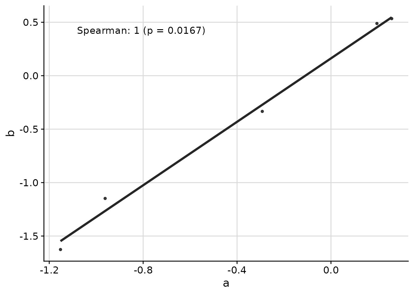
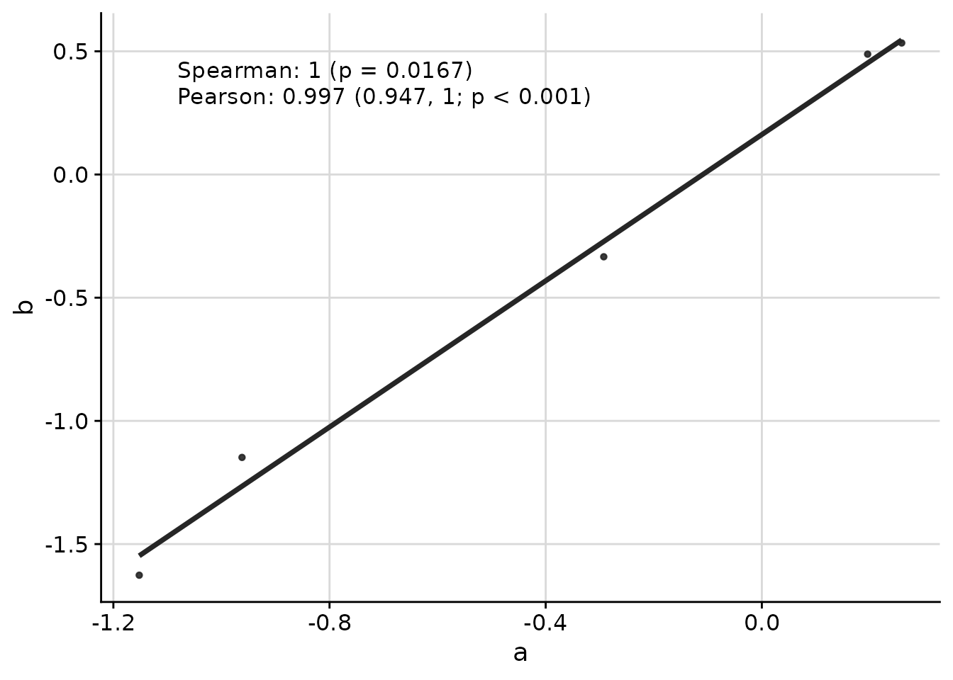
Multiple Correlation Methods
You can display multiple correlation coefficients simultaneously:
ggcorr(
  data = response_tbl %>% dplyr::filter(group %in% c("a", "b")),
  grp = "group",
  y = "response",
  id = "pid",
  corr_method = c("spearman", "pearson")
)
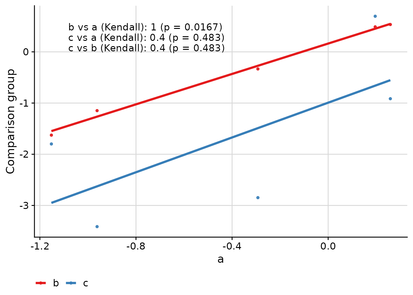
Comparing Multiple Groups
When comparing more than two groups, the function creates pairwise comparisons:
ggcorr(
  data = response_tbl,
  grp = "group",
  y = "response",
  id = "pid",
  corr_method = "kendall"
)
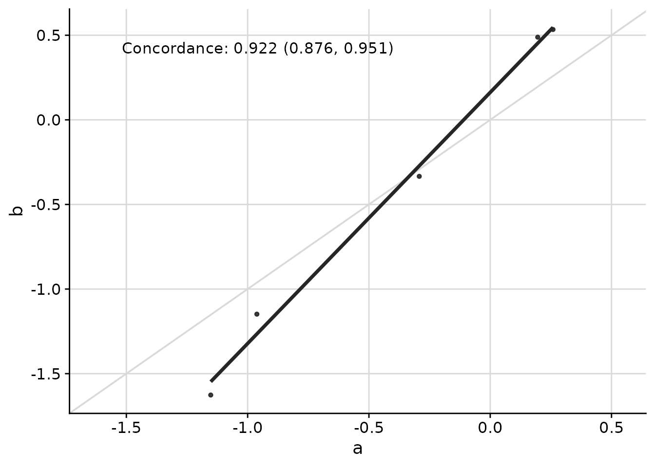
Concordance Correlation Coefficient
The concordance correlation coefficient is useful when assessing agreement between two methods:
ggcorr(
  data = response_tbl %>% dplyr::filter(group %in% c("a", "b")),
  grp = "group",
  y = "response",
  id = "pid",
  corr_method = "concordance",
  abline = TRUE,
  limits_equal = TRUE
)
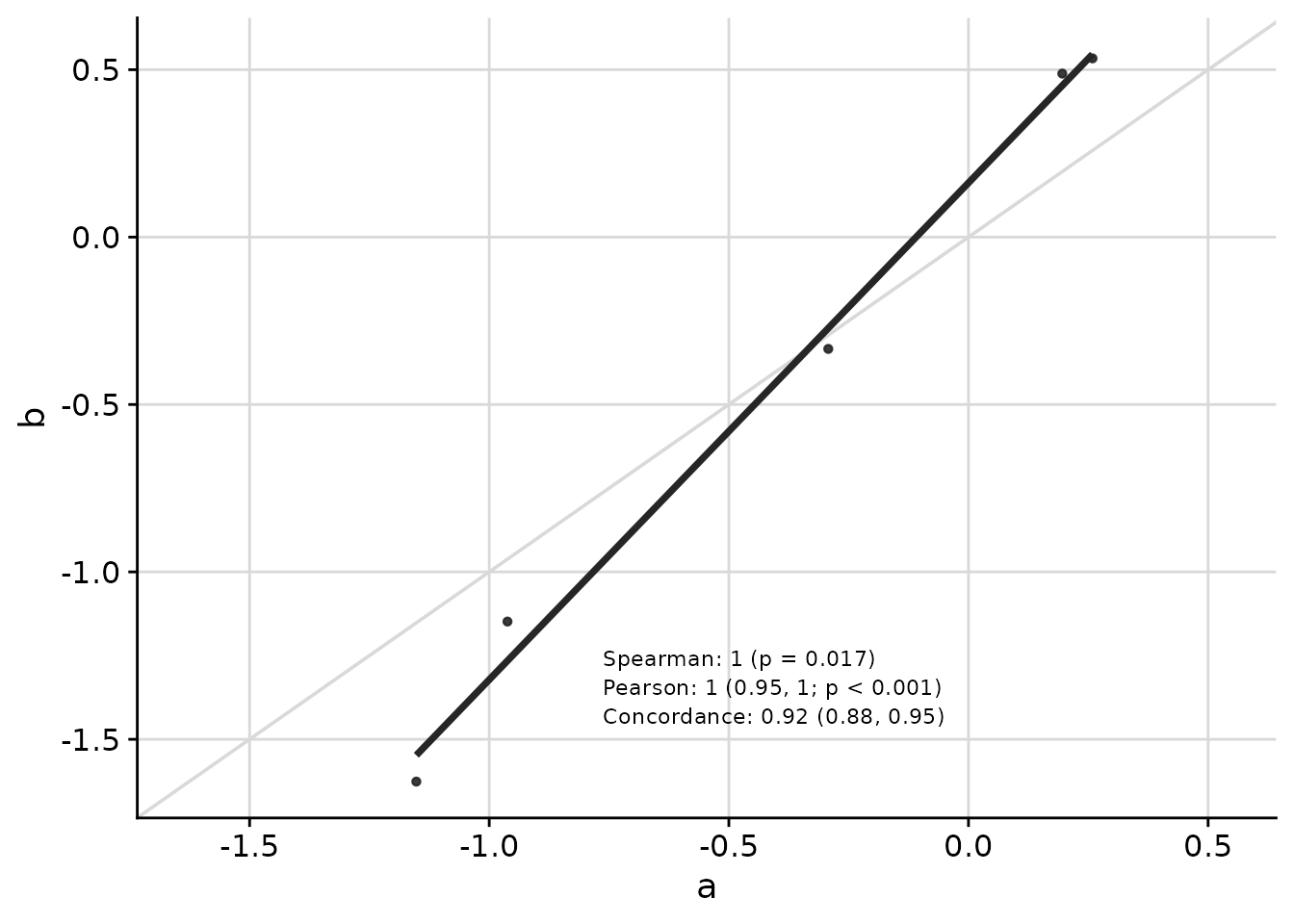
Customizing Appearance
Text placement, font size, and other visual elements can be customized:
ggcorr(
  data = response_tbl %>% dplyr::filter(group %in% c("a", "b")),
  grp = "group",
  y = "response",
  id = "pid",
  corr_method = c("spearman", "pearson", "concordance"),
  abline = TRUE,
  limits_equal = TRUE,
  coord = c(0.4, 0.17),
  font_size = 3,
  skip = 0.04,
  pval_signif = 2,
  est_signif = 2,
  ci_signif = 2
)
Axis Transformations
The text placement remains consistent even when axes are transformed:
ggcorr(
  data = response_tbl %>% dplyr::mutate(response = abs(response + 1)^4),
  grp = "group",
  y = "response",
  id = "pid",
  corr_method = "spearman",
  abline = TRUE,
  limits_equal = TRUE,
  trans = "log10",
  skip = 0.06
)![]()
Managing Axis Limits with axis_limits
The axis_limits function helps manage axis limits,
particularly useful for forcing equal limits on both axes or expanding
axis coordinates.
data("cars", package = "datasets")

p0 <- ggplot(cars, aes(speed, dist)) +
  cowplot::background_grid(major = "xy") +
  geom_point() +
  theme(plot.title = element_text(hjust = 0.5)) +
  labs(title = "Axes unadjusted") +
  labs(x = "Speed", y = "Distance")

p1 <- axis_limits(
  p = p0,
  limits_equal = TRUE
) +
  labs(title = "Axes limits equal")

p2 <- axis_limits(
  p = p0,
  limits_expand = list(
    x = c(0, 50),
    y = c(-10, 200)
  )
) +
  labs(title = "Axes limits expanded")

cowplot::plot_grid(p0, p1, p2)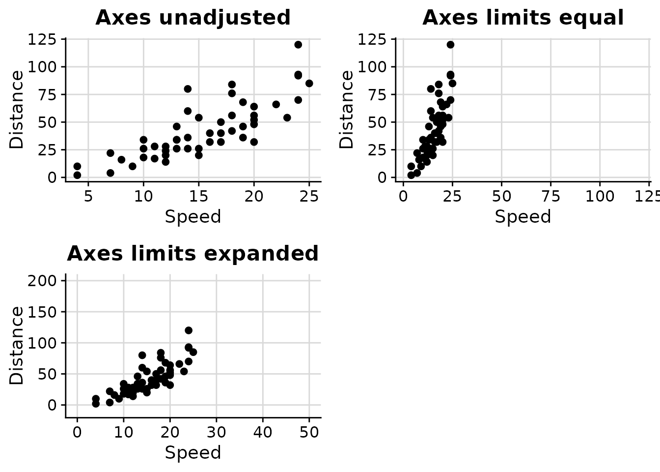
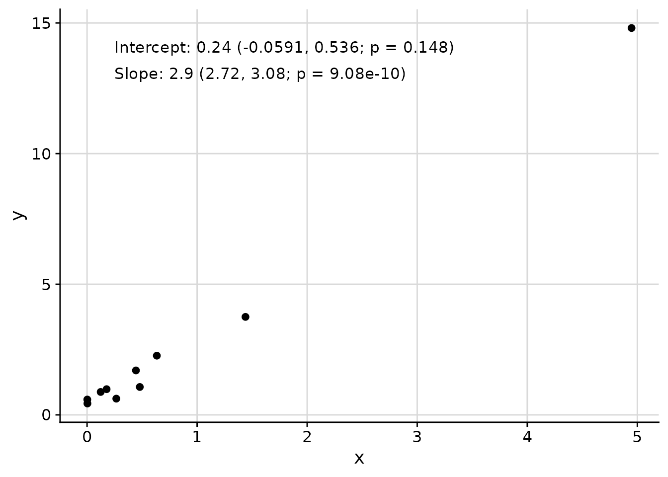
Adding Text Annotations with add_text_column
The add_text_column function adds text annotations to
plots at consistent positions, regardless of underlying axis
transformations.
data_mod <- data.frame(x = rnorm(mean = 1, 10)^2)
data_mod$y <- data_mod$x * 3 + rnorm(10, sd = 0.5)
fit <- lm(y ~ x, data = data_mod)
coef_tbl <- coefficients(summary(fit))
results_vec <- c(
  paste0(
    "Intercept: ",
    signif(coef_tbl[1, "Estimate"][[1]], 2),
    " (",
    signif(coef_tbl[1, 1][[1]] - 2 * coef_tbl[1, 2][[1]], 3),
    ", ",
    signif(coef_tbl[1, 1][[1]] + 2 * coef_tbl[1, 2][[1]], 3),
    "; p = ",
    signif(coef_tbl[1, 4][[1]], 3),
    ")"
  ),
  paste0(
    "Slope: ",
    signif(coef_tbl[2, "Estimate"][[1]], 2),
    " (",
    signif(coef_tbl[2, 1][[1]] - 2 * coef_tbl[2, 2][[1]], 3),
    ", ",
    signif(coef_tbl[2, 1][[1]] + 2 * coef_tbl[2, 2][[1]], 3),
    "; p = ",
    signif(coef_tbl[2, 4][[1]], 3),
    ")"
  )
)

p <- ggplot(
  data = data_mod,
  aes(x = x, y = y)
) +
  geom_point() +
  cowplot::background_grid(major = "xy")

add_text_column(
  p = p,
  x = data_mod$x,
  y = data_mod$y,
  text = results_vec,
  coord = c(0.05, 0.95),
  skip = 0.07
)
Cluster-Specific Plots
The plot_cluster_* family of functions helps visualise
the characteristics of clusters identified by an unsupervised learning
method. The examples below use the palmerpenguins dataset:
we first apply k-means clustering to bill and flipper measurements, then
explore the clusters using each function.
set.seed(42)
penguins <- palmerpenguins::penguins
penguins <- penguins[complete.cases(penguins[
  c("bill_length_mm", "bill_depth_mm", "flipper_length_mm", "body_mass_g")
]), ]
vars_penguin <- c(
  "bill_length_mm", "bill_depth_mm", "flipper_length_mm", "body_mass_g"
)
km <- kmeans(scale(penguins[vars_penguin]), centers = 3)
penguins$cluster <- paste0("K", km$cluster)
Heat Maps with plot_cluster_heatmap
The plot_cluster_heatmap function creates a heat map
where each tile shows the percentile of the median value of a variable
for a cluster. This percentile is compared against the empirical
cumulative distribution function (ECDF) of that variable across all
observations not in the cluster. Clusters and variables are ordered
along the axes via hierarchical clustering.
plot_cluster_heatmap(penguins, cluster = "cluster", vars = vars_penguin)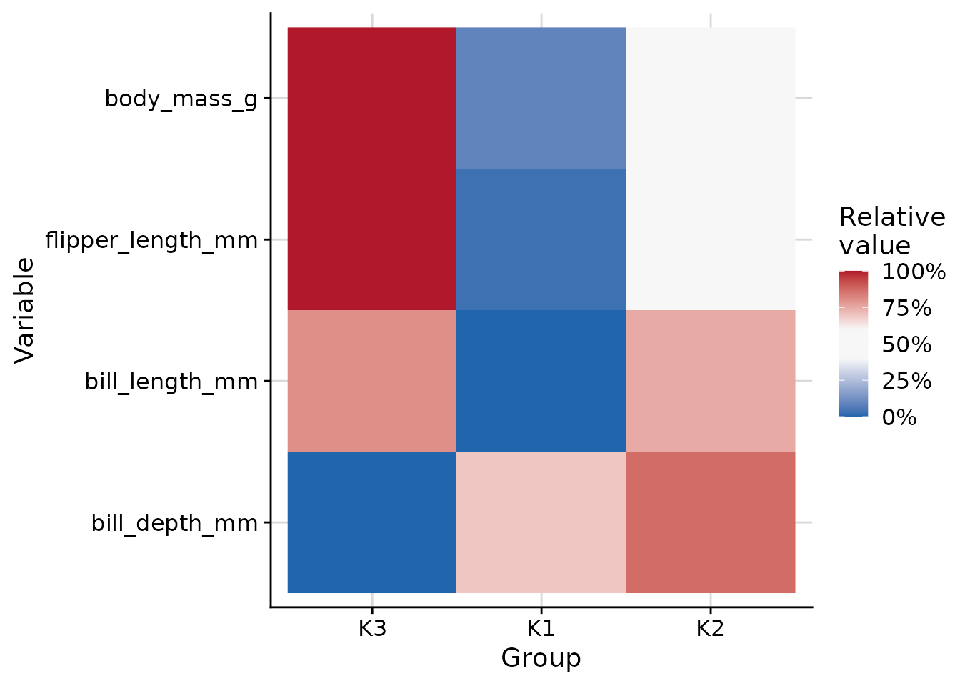
Automatic Colour Palettes
The plot_cluster_density,
plot_cluster_scatter, and plot_cluster_mst
functions (and their plot_group_* equivalents)
automatically choose a group colour palette via the
palette_cluster argument (default "auto"):
| Groups | Palette | Notes |
|---|---|---|
| 1 – 8 | Okabe-Ito | Colorblind-safe |
| 9 – 12 | ColorBrewer Paired | Light/dark pairs of 6 hues |
| 13 – 21 | Kelly (Polychrome) | Maximum-contrast sequence |
| 22 – 31 | Glasbey (Polychrome) | Algorithmically spaced colours |
| > 31 | hue_pal() |
Fallback with a warning |
The Polychrome package is optional; if it is not
installed the Kelly/Glasbey tiers fall back to hue_pal()
with a warning. You can override the automatic selection for any group
count by setting palette_cluster explicitly:
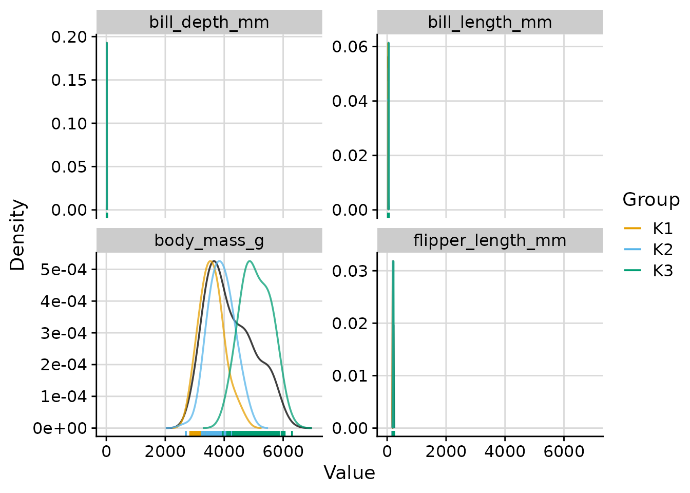
# Force the Paired palette for the 3-cluster solution
plot_cluster_density(
  penguins,
  cluster  = "cluster",
  vars     = vars_penguin,
  n_col    = 2,
  palette_cluster = "paired"
)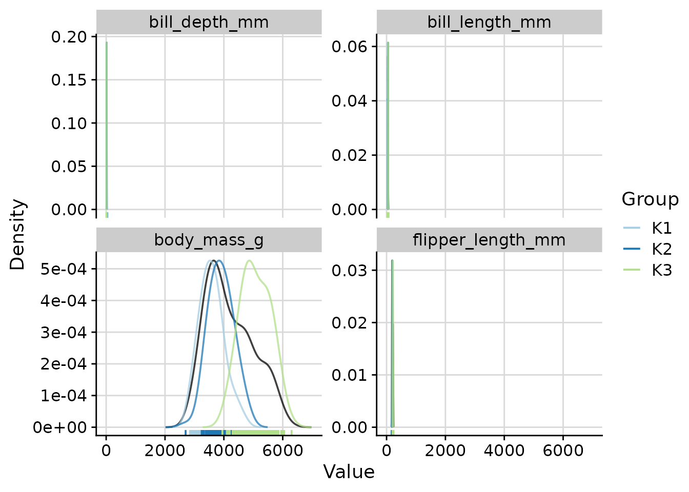
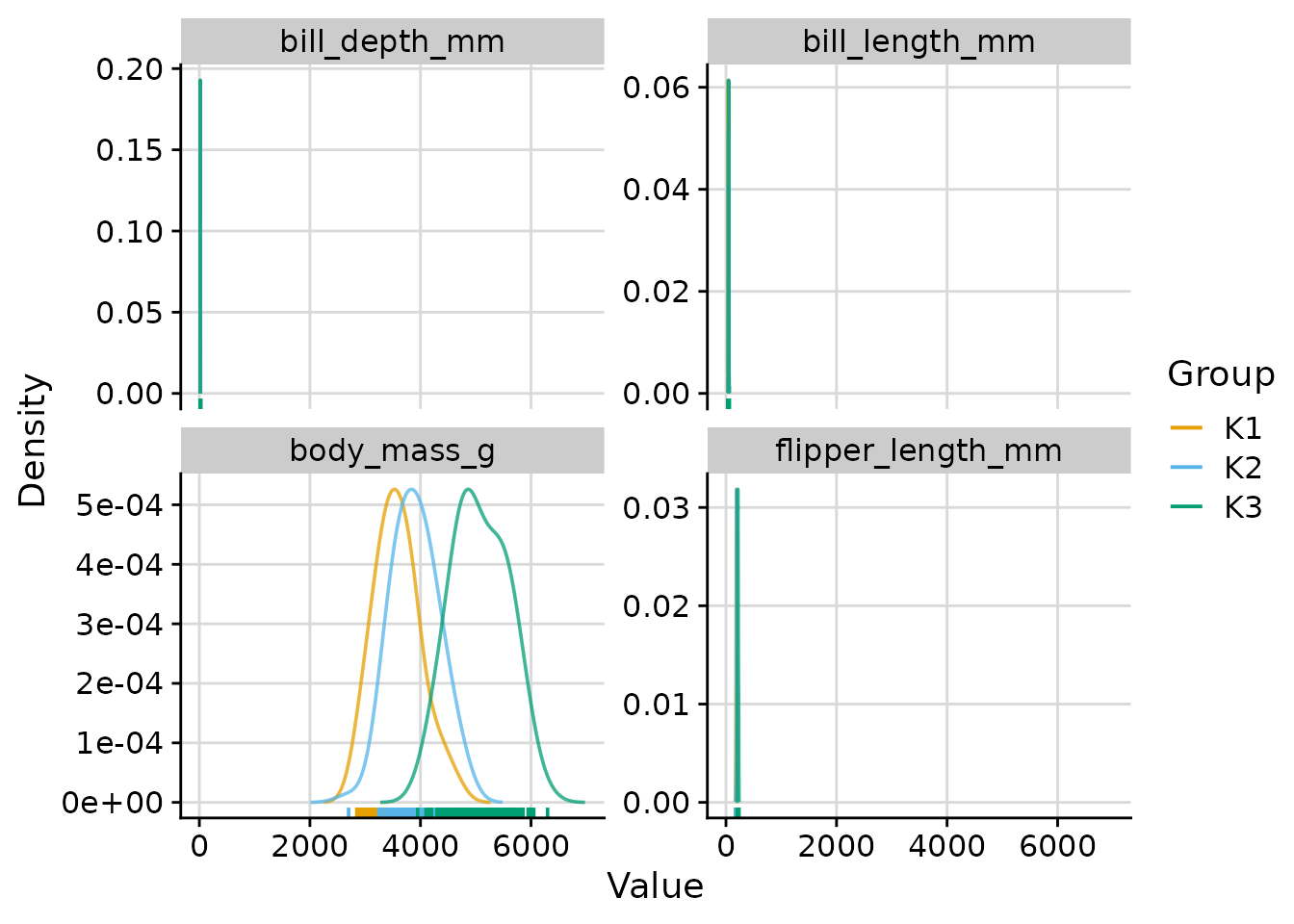
Density Plots with plot_cluster_density
The plot_cluster_density function visualises, for each
variable, how each cluster’s observations are distributed relative to
the overall population. The density argument controls what
is shown:
-
"both"(default): overall density plus per-cluster density curves. -
"overall": the overall density with per-cluster median lines. -
"cluster": one density curve per cluster.
Overall and per-cluster density curves (default)
plot_cluster_density(
  penguins,
  cluster = "cluster",
  vars = vars_penguin,
  n_col = 2
)
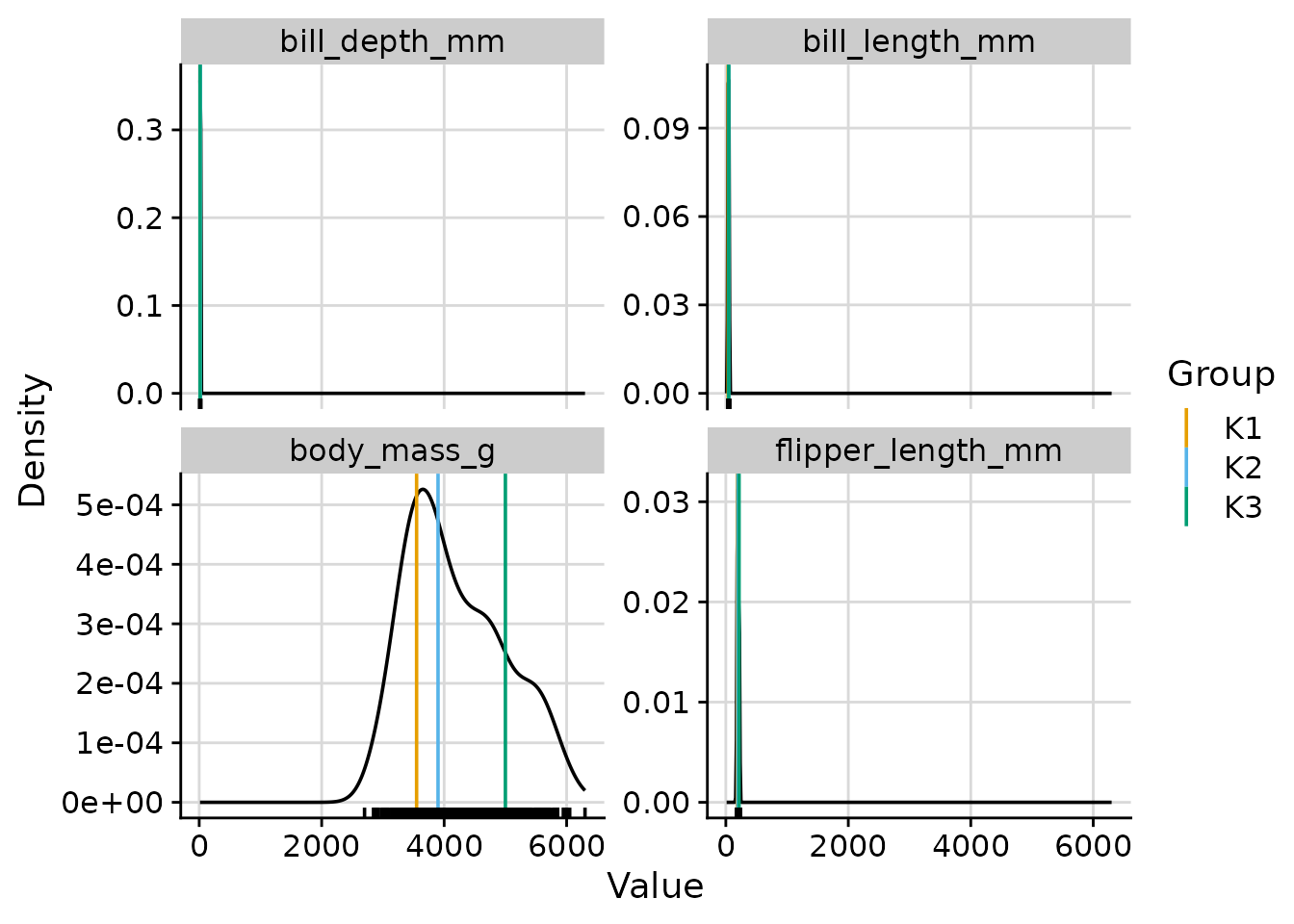
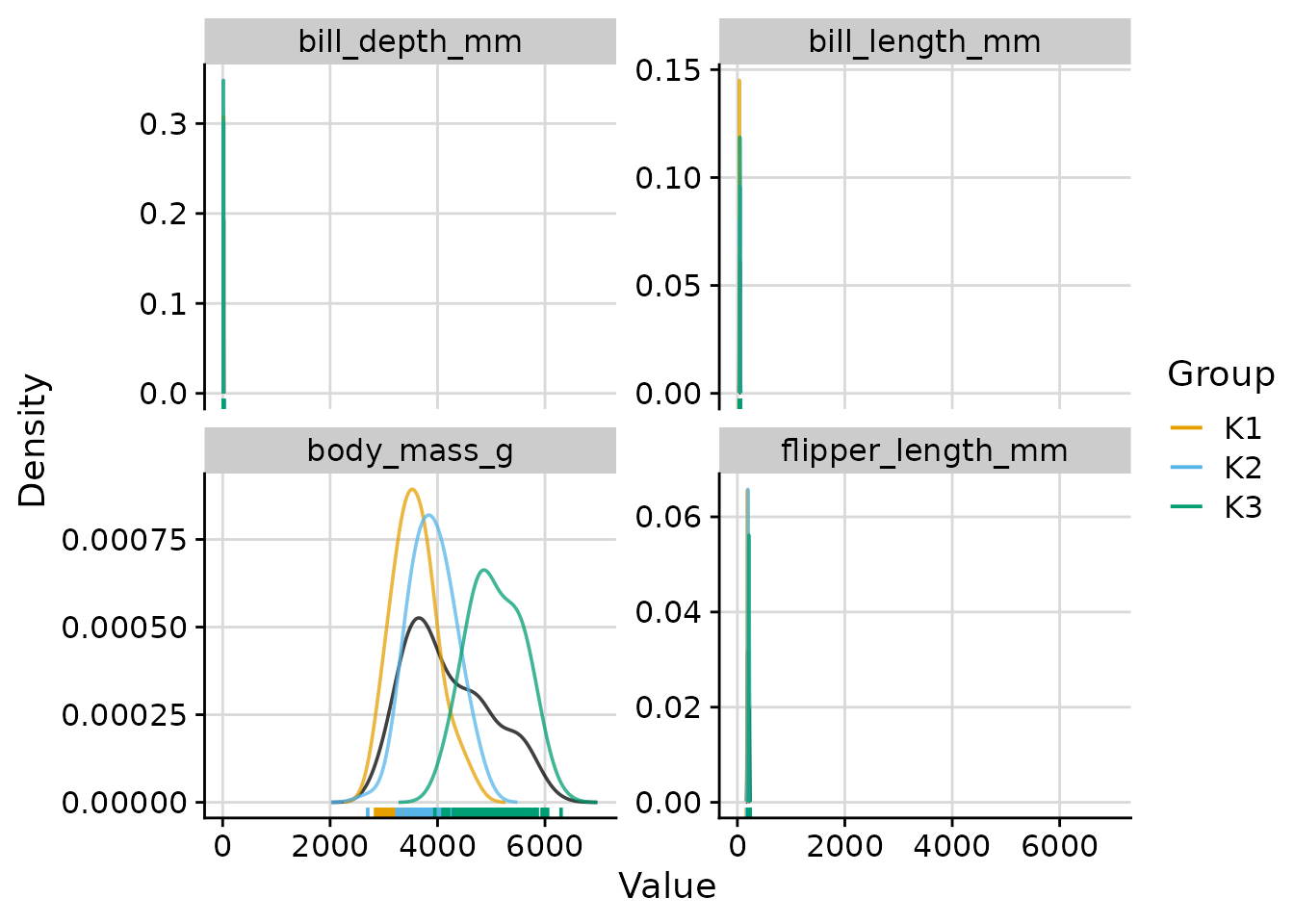
Overall density with cluster median lines
plot_cluster_density(
  penguins,
  cluster = "cluster",
  vars = vars_penguin,
  density = "overall",
  n_col = 2
)
Per-cluster density curves only
plot_cluster_density(
  penguins,
  cluster = "cluster",
  vars = vars_penguin,
  density = "cluster",
  n_col = 2
)
Scaling cluster density curves
When density is "both" or
"cluster", the scale argument controls how
cluster curves are scaled relative to the overall density:
-
"max_overall"(default): each cluster density is rescaled so that its maximum equals the maximum of the overall density. Y-axis values reflect the overall density. -
"max_cluster": no rescaling; the y-axis is determined by the tallest curve. -
"free": no rescaling (equivalent to"max_cluster").
# scale = "max_cluster": natural scale for all curves
plot_cluster_density(
  penguins,
  cluster = "cluster",
  vars = vars_penguin,
  density = "both",
  scale = "max_cluster",
  n_col = 2
)
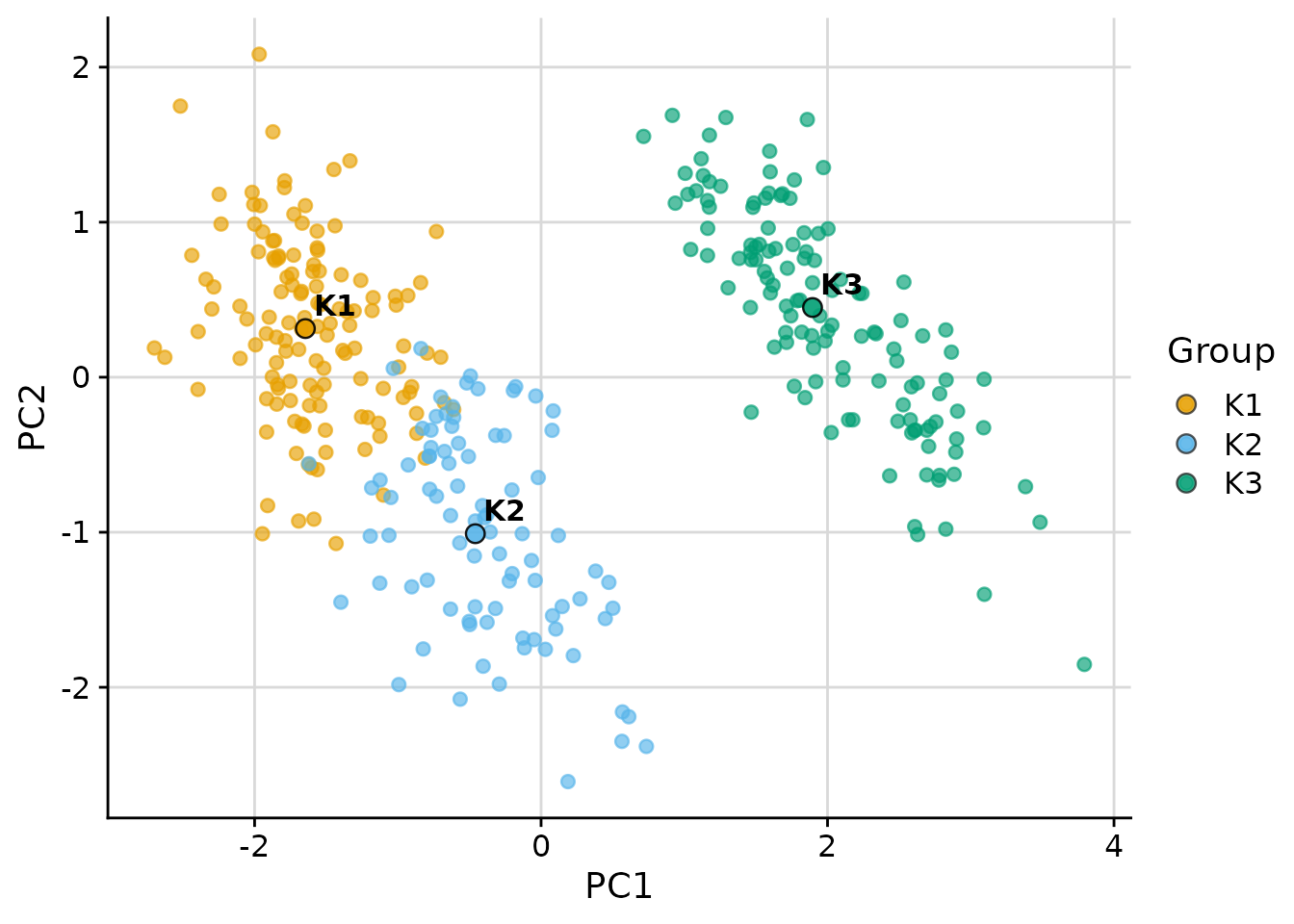
Scatter Plot with plot_cluster_scatter
The plot_cluster_scatter function creates a biaxial
scatter plot with observations coloured by cluster and median centroids
overlaid. It supports four dimensionality reduction methods via the
dim_red argument: "none", "pca",
"tsne", and "umap".
PCA projection (default for more than two variables)
plot_cluster_scatter(
  penguins,
  cluster = "cluster",
  vars = vars_penguin,
  dim_red = "pca"
)
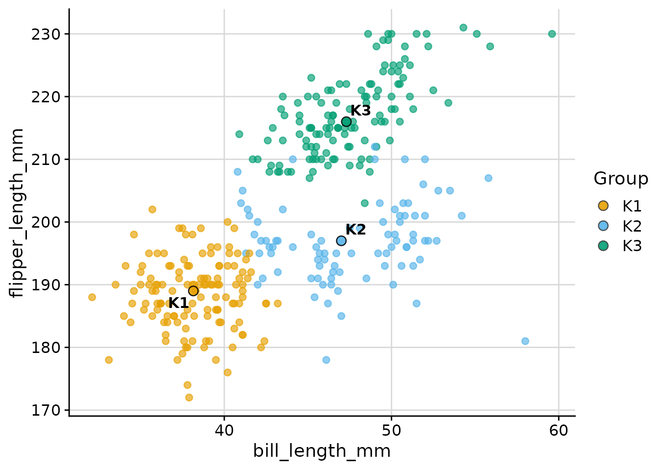
Raw variables (dim_red = "none")
When exactly two variables are needed directly as axes:
plot_cluster_scatter(
  penguins,
  cluster = "cluster",
  vars = c("bill_length_mm", "flipper_length_mm"),
  dim_red = "none"
)
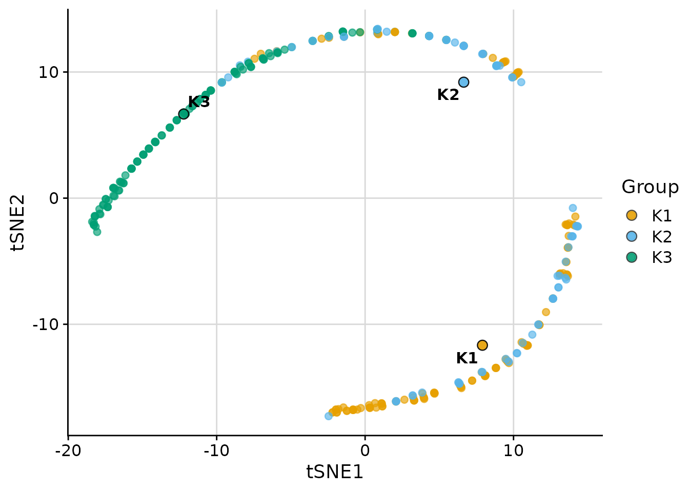
t-SNE
t-SNE is available when the Rtsne package is
installed:
plot_cluster_scatter(
  penguins,
  cluster = "cluster",
  vars = vars_penguin,
  dim_red = "tsne"
)
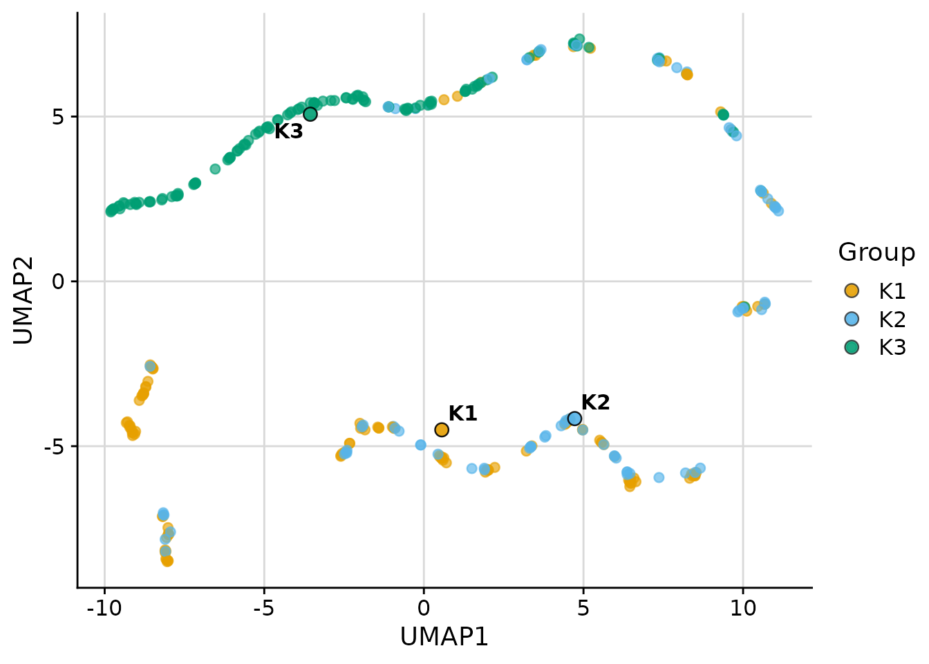
UMAP
UMAP is available when the umap package is
installed:
plot_cluster_scatter(
  penguins,
  cluster = "cluster",
  vars = vars_penguin,
  dim_red = "umap"
)
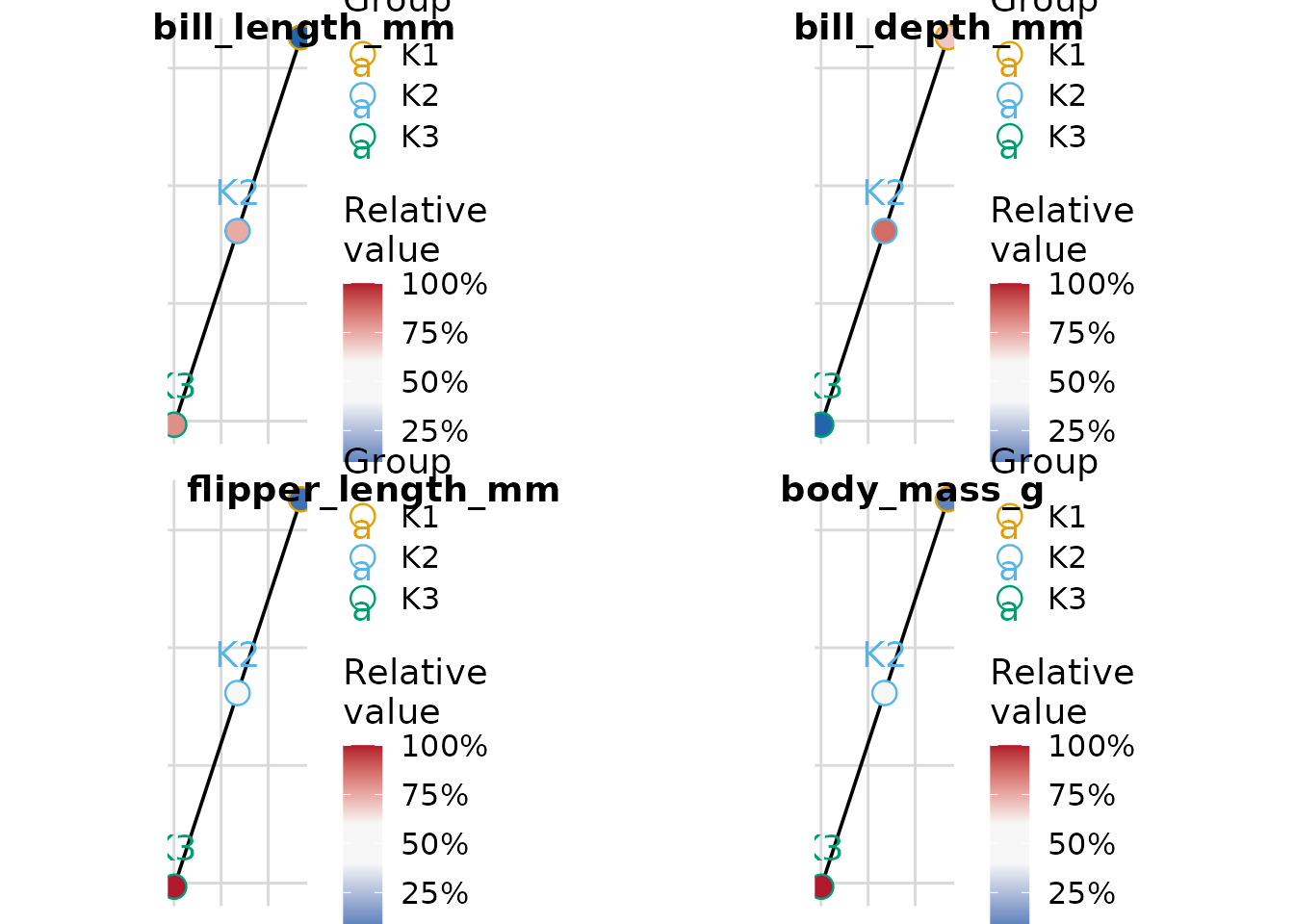
Minimum-Spanning Tree with plot_cluster_mst
The plot_cluster_mst function computes the
minimum-spanning tree (MST) over clusters, using Euclidean distance
between cluster median profiles. Clusters are positioned in two
dimensions via classical multidimensional scaling (MDS). For each
variable, a separate plot shows each cluster node filled by the
ECDF-standardised percentile of that cluster’s median — the same colour
scale used by plot_cluster_heatmap. By default a named list
of plots is returned; supplying n_col or n_row
returns a combined cowplot::plot_grid figure with variable
names as labels.
plot_cluster_mst(
  penguins,
  cluster = "cluster",
  vars = vars_penguin,
  n_col = 2
)