UtilsGGSV provides ggplot2-based utilities that solve two common pain points in exploratory data analysis:
-
Cluster / group characterisation — the
plot_group_*family creates publication-ready plots that help you understand what makes each cluster (or any labelled group) distinctive:-
plot_group_heatmap()— ECDF-percentile heat map showing each group’s relative position for every variable. -
plot_group_density()— per-variable density plots with per-group overlays (density curves and/or median lines). -
plot_group_scatter()— biaxial scatter with optional PCA / t-SNE / UMAP projection and cluster centroids. -
plot_group_mst()— minimum-spanning-tree layout coloured by the same ECDF scale as the heat map.
-
-
Correlation visualisation —
ggcorr()creates paired scatter plots with Spearman, Pearson, Kendall, or concordance correlation coefficients overlaid as a formatted table, with support for log / asinh / anyscalestransformation.
Additional helpers round out the toolkit:
-
axis_limits()— force equal axis limits or expand axis coordinates without manually computing values. -
add_text_column()— place a column of text annotations at a consistent relative position regardless of the underlying axis transformation. -
get_trans()— retrieve anyscalestransformation by name, including higher-root andasinhtransformations not available in basescales.
Installation
You can install UtilsGGSV from GitHub with:
if (!requireNamespace("remotes", quietly = TRUE)) install.packages("remotes")
remotes::install_github("SATVILab/UtilsGGSV")
Examples
Correlation Plots with ggcorr
The function ggcorr plots correlation coefficients:
set.seed(3)
response_vec_a <- rnorm(5)
response_tbl <- data.frame(
group = rep(letters[1:3], each = 5),
response = c(
response_vec_a,
response_vec_a * 1.2 + rnorm(5, sd = 0.2),
response_vec_a * 2 + rnorm(5, sd = 2)
),
pid = rep(paste0("id_", 1:5), 3)
)
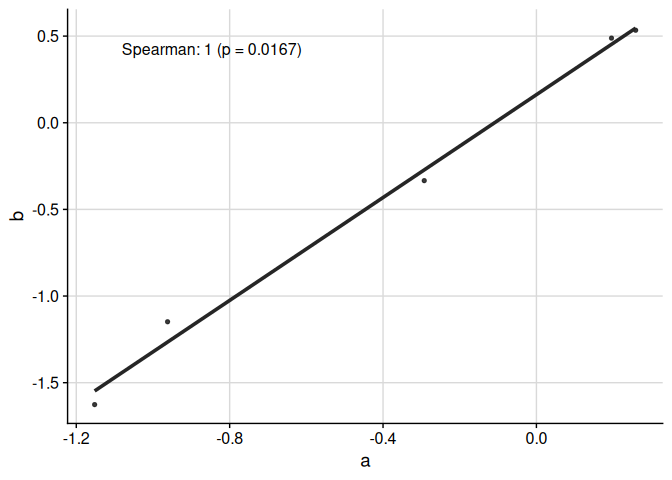
ggcorr(
data = response_tbl %>% dplyr::filter(group %in% c("a", "b")),
grp = "group",
y = "response",
id = "pid"
)
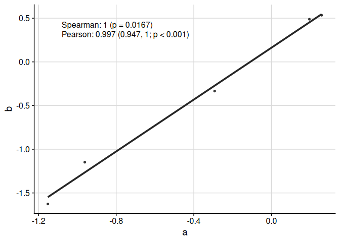
We can display multiple correlation coefficients:
ggcorr(
  data = response_tbl %>% dplyr::filter(group %in% c("a", "b")),
  grp = "group",
  y = "response",
  id = "pid",
  corr_method = c("spearman", "pearson")
)
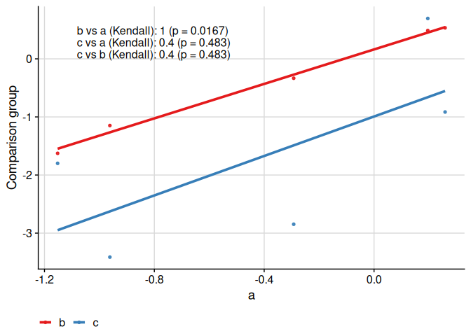
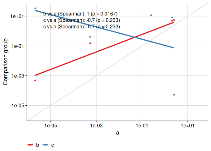
We can compare more than two groups:
ggcorr(
  data = response_tbl,
  grp = "group",
  y = "response",
  id = "pid",
  corr_method = "kendall"
)
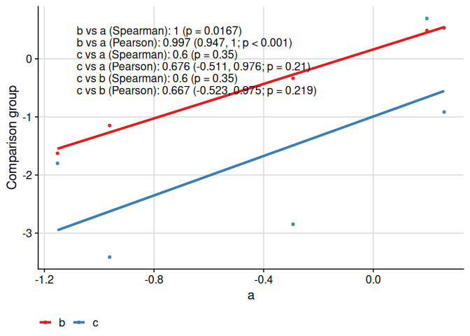
We can compare more than two groups and multiple correlation coefficients:
ggcorr(
  data = response_tbl,
  grp = "group",
  y = "response",
  id = "pid",
  corr_method = c("spearman", "pearson")
)
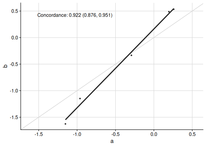
Specific functionality to make appropriate plots for the concordance correlation coefficient is available:
ggcorr(
  data = response_tbl %>% dplyr::filter(group %in% c("a", "b")),
  grp = "group",
  y = "response",
  id = "pid",
  corr_method = "concordance",
  abline = TRUE,
  limits_equal = TRUE
)
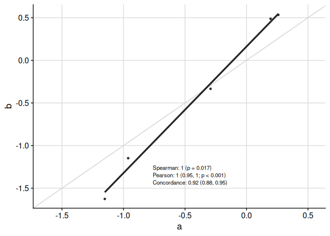
Text in table can be moved around and resized:
ggcorr(
  data = response_tbl %>% dplyr::filter(group %in% c("a", "b")),
  grp = "group",
  y = "response",
  id = "pid",
  corr_method = c("spearman", "pearson", "concordance"),
  abline = TRUE,
  limits_equal = TRUE,
  coord = c(0.4, 0.17),
  font_size = 3,
  skip = 0.04,
  pval_signif = 2,
  est_signif = 2,
  ci_signif = 2
)
Finally, the text placement is kept consistent when the axes are visually transformed:
ggcorr(
  data = response_tbl %>% dplyr::mutate(response = abs(response + 1)^4),
  grp = "group",
  y = "response",
  id = "pid",
  corr_method = "spearman",
  abline = TRUE,
  limits_equal = TRUE,
  trans = "log10",
  skip = 0.06
)
Axis Limits with axis_limits
Fix axis limits to be equal between x- and y-axes, and/or expand axis coordinates. The primary use of axis_limits is forcing the x- and y-axes to have the same limits “automatically” (i.e. by inspecting the ggplot object, thus not requiring the user to manually calculate limits to pass to ggplot2::expand_limits).
data("cars", package = "datasets")

p0 <- ggplot(cars, aes(speed, dist)) +
  cowplot::background_grid(major = "xy") +
  geom_point() +
  theme(plot.title = element_text(hjust = 0.5)) +
  labs(title = "Axes unadjusted") +
  labs(x = "Speed", y = "Distance")
p1 <- axis_limits(
  p = p0,
  limits_equal = TRUE
) +
  labs(title = "Axes limits equal")
p2 <- axis_limits(
  p = p0,
  limits_expand = list(
    x = c(0, 50),
    y = c(-10, 200)
  )
) +
  labs(title = "Axes limits expanded")
cowplot::plot_grid(p0, p1, p2)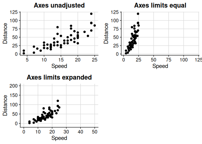
Text Annotations with add_text_column
Add a column of text easily to a plot, regardless of underlying transformation, using add_text_column.
data_mod <- data.frame(x = rnorm(mean = 1, 10)^2)
data_mod$y <- data_mod$x * 3 + rnorm(10, sd = 0.5)
fit <- lm(y ~ x, data = data_mod)
coef_tbl <- coefficients(summary(fit))
results_vec <- c(
  paste0(
    "Intercept: ",
    signif(coef_tbl[1, "Estimate"][[1]], 2),
    " (",
    signif(coef_tbl[1, 1][[1]] - 2 * coef_tbl[1, 2][[1]], 3),
    ", ",
    signif(coef_tbl[1, 1][[1]] + 2 * coef_tbl[1, 2][[1]], 3),
    "; p = ",
    signif(coef_tbl[1, 4][[1]], 3),
    ")"
  ),
  paste0(
    "Slope: ",
    signif(coef_tbl[2, "Estimate"][[1]], 2),
    " (",
    signif(coef_tbl[2, 1][[1]] - 2 * coef_tbl[2, 2][[1]], 3),
    ", ",
    signif(coef_tbl[2, 1][[1]] + 2 * coef_tbl[2, 2][[1]], 3),
    "; p = ",
    signif(coef_tbl[2, 4][[1]], 3),
    ")"
  )
)
p <- ggplot(
  data = data_mod,
  aes(x = x, y = y)
) +
  geom_point() +
  cowplot::background_grid(major = "xy")
add_text_column(
  p = p,
  x = data_mod$x,
  y = data_mod$y,
  text = results_vec,
  coord = c(0.05, 0.95),
  skip = 0.07
)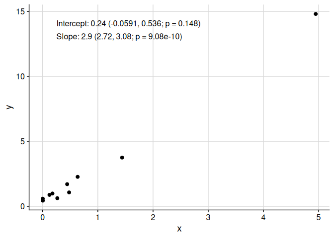
Note that add_text_column places text in the same position, regardless of underlying transformation.
p <- p +
  scale_y_continuous(
    trans = UtilsGGSV::get_trans("asinh")
  )
add_text_column(
  p = p,
  x = data_mod$x,
  y = data_mod$y,
  text = results_vec,
  trans = UtilsGGSV::get_trans("asinh"),
  coord = c(0.05, 0.95),
  skip = 0.07
)![]()
Cluster-Specific Plots
The plot_cluster_* family of functions helps visualise the characteristics of clusters identified by an unsupervised learning method.
Heat Maps with plot_cluster_heatmap
The function plot_cluster_heatmap creates a heat map where each tile shows the percentile of the median value of a variable for a cluster. This percentile is compared against the ECDF of that variable across all observations not in the cluster. Clusters and variables are ordered by hierarchical clustering.
set.seed(1)
cluster_data <- data.frame(
  cluster = rep(paste0("C", 1:3), each = 20),
  var1 = c(rnorm(20, 2), rnorm(20, 0), rnorm(20, -2)),
  var2 = c(rnorm(20, -1), rnorm(20, 1), rnorm(20, 0))
)
plot_cluster_heatmap(cluster_data, cluster = "cluster")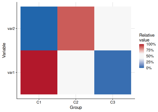
Density Plots with plot_cluster_density
The function plot_cluster_density visualises, for each variable, how each cluster’s observations are distributed relative to the overall population. The density argument controls what is shown: "overall" (default, overall density plus cluster median lines), "cluster" (one density curve per cluster), or "both" (overall density plus per-cluster density curves). When showing per-cluster densities, the scale argument controls scaling: by default ("max_overall") each cluster density is rescaled so its maximum equals the overall density maximum.
set.seed(1)
cluster_data <- data.frame(
  cluster = rep(paste0("C", 1:3), each = 20),
  var1 = c(rnorm(20, 2), rnorm(20, 0), rnorm(20, -2)),
  var2 = c(rnorm(20, -1), rnorm(20, 1), rnorm(20, 0))
)
# Default: overall density with cluster median lines
plot_cluster_density(cluster_data, cluster = "cluster")
#> $var1
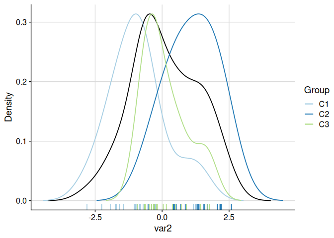
# Both overall and per-cluster densities (scaled to overall maximum)
plot_cluster_density(cluster_data, cluster = "cluster", density = "both")
#> $var1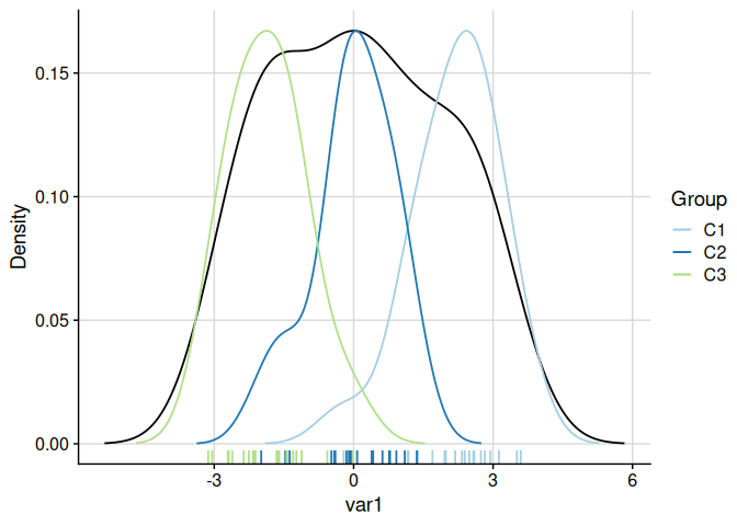

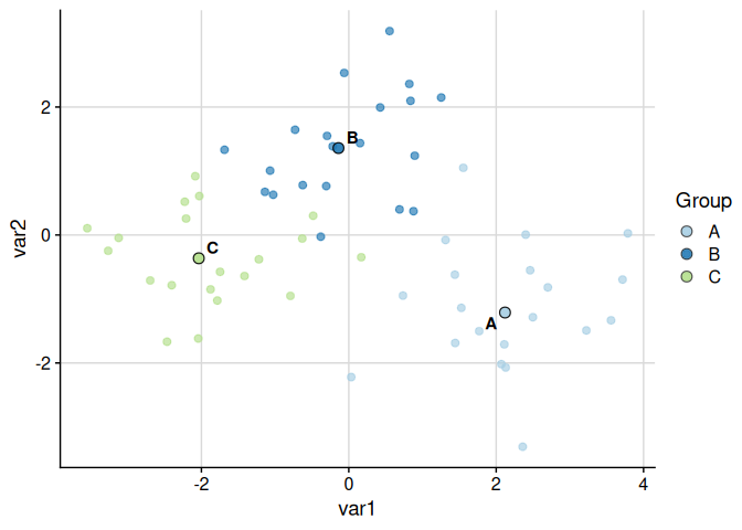
Scatter Plot with plot_cluster_scatter
The function plot_cluster_scatter creates a biaxial scatter plot with observations coloured by cluster and median centroids overlaid. When more than two variables are supplied it defaults to a PCA projection.
set.seed(123)
example_data <- data.frame(
  cluster = rep(c("A", "B", "C"), each = 20),
  var1 = c(rnorm(20, 2), rnorm(20, 0), rnorm(20, -2)),
  var2 = c(rnorm(20, -1), rnorm(20, 1), rnorm(20, 0)),
  var3 = c(rnorm(20, 1), rnorm(20, -1), rnorm(20, 0))
)

# Default: PCA projection (> 2 numeric variables)
plot_cluster_scatter(example_data, cluster = "cluster")
#> dim_red automatically set to 'pca' because more than two numeric variables are available.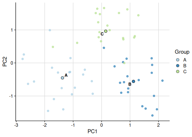
Raw variables can also be used directly:
plot_cluster_scatter(
  example_data,
  cluster = "cluster",
  dim_red = "none",
  vars = c("var1", "var2")
)
Minimum-Spanning Tree with plot_cluster_mst
The function plot_cluster_mst computes the minimum-spanning tree (MST) over clusters, using Euclidean distance between cluster median profiles. Clusters are laid out in two dimensions via classical multidimensional scaling (MDS). For each variable, a separate plot is produced in which each node is filled according to the ECDF-standardised percentile of that cluster’s median — the same colour scale used by plot_cluster_heatmap. By default a named list of plots is returned; supplying n_col or n_row returns a combined cowplot::plot_grid figure.
set.seed(1)
cluster_data <- data.frame(
  cluster = rep(paste0("C", 1:3), each = 20),
  var1 = c(rnorm(20, 2), rnorm(20, 0), rnorm(20, -2)),
  var2 = c(rnorm(20, -1), rnorm(20, 1), rnorm(20, 0))
)
# Default: returns a named list of plots, one per variable
plot_list <- plot_cluster_mst(cluster_data, cluster = "cluster")
plot_list[["var1"]]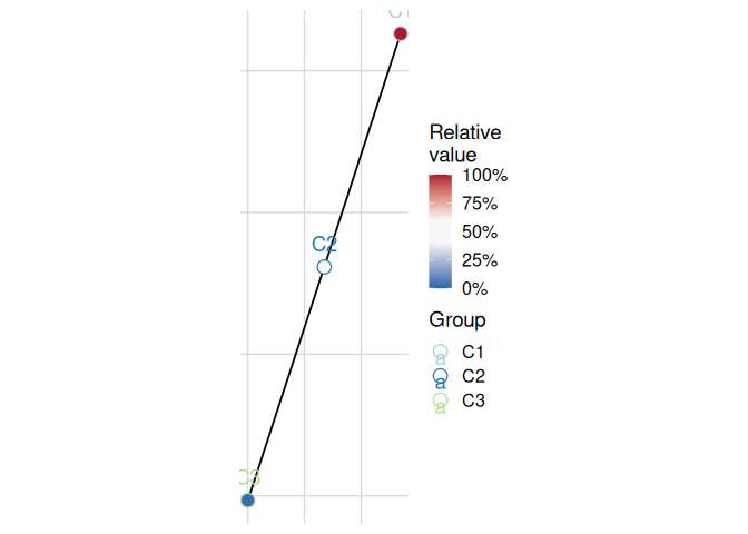
Combine into a grid with variable-name labels:
plot_cluster_mst(cluster_data, cluster = "cluster", n_col = 2)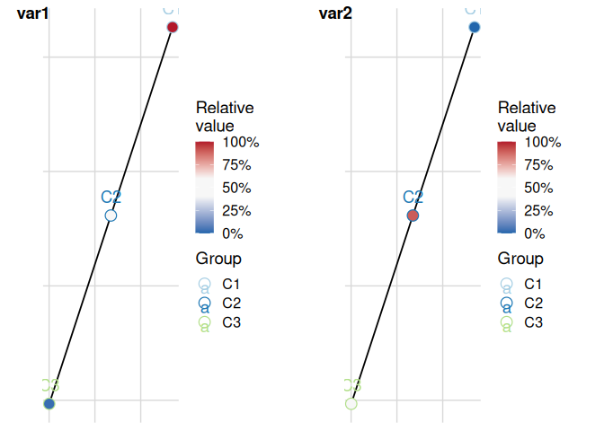
Transformations with get_trans
The utility function get_trans returns trans objects (as implemented by the scales package) when given characters. It also adds various higher roots (such as cubic and quartic) and adds the asinh transformation.
get_trans("log10")
#> Transformer: log-10 [1e-100, Inf]